Friday, August 30, 2013

Sad mess...


Well folks, I am swallowing my pride and posting my poor Steeple Rock painting for the whole world to see.  It just went wrong, I just went wrong from the get go.


So, I put the lower half into water, soaked it good and began to scrub.  The wild colors came off okay, exposing the wild colors I had put on the lower layers, which weren't any better than what I washed off.  Good thing this is 300lb. paper, it takes a beating.  For some reason I put a layer of red over the foreground.  Don't ask, I don't know! Here's what it looked like when I finally decided to start with soft pastels.  This is painful.


So, the roughness of the paper was fun to work on.  Knowing it was ruined was pretty liberating, I just added whatever colors sounded fun and started adding pigment!  I have to say it is frustrating, but I also have to admit that I learned a LOT from this project.  I will probably just spray some fixative on it and let it hang around to bug me for a few days.  After that I may soak it in the bathtub and see what happens.  Or burn it.  Either way, I am showing my result and you may sympathize or laugh. Your choice.

Life is grand, busy, but grand!

Working to rescue "Steeple Rock" today.  Will post later.. Stay tuned!


Wednesday, August 28, 2013

Yet another landscape fight. Dang it.

Persevere...  Sometimes I hate that word.  Finish every piece.  Now who said that?  Rats, I have to practice what I preach.  I began the Steeple Rock piece on the right track.  Steeple Rock was my subject, shadows were sharp and the sky was just right.


I dropped the colors into wet paper and was tickled with how they began to develop.


 I wanted soft shadows on the middle ground, so I laid them in lightly and wet.  So far, so good.  However, this is the part where I clench up and begin to ruin my landscapes!  Not sure why I get so uptight about this part, but I certainly do.  I get totally lost.


Darker colors, warmer colors appear to come forward.  I began to darken and warm up and boy did I warm up!  Nice, hot red right in the middle ground.  Now you don't see the subject, you see the middle ground.  What a mess.  I went to bed with a headache and frustrated to the max.  Now I have to figure out how I'm going to finish this.  I may scrub out the red hillsides and make the foreground quite dark and brownish red.  I may have to start again with pastels over the top of it.  Oh well, stay tuned.  If you can bear it!


Monday, August 26, 2013

New Book, New Ideas

I just received a new book in the mail, The Art of Maynard Dixon, by Donald Hagerty.  I have been looking up Dixon's work for weeks now, pouring over the images and trying to learn how he handled his landscapes.  I am in LOVE with his work.  As you know, I have struggled with landscapes for ever.  I think Dixon's use of simplification is something I can wrap my mind around and use as I learn to find my own way through the landscape riddle.  Now I can see the photos of his paintings in printed form and not just on my iPad screen.  Very excited to read this.


To see some of his paintings and read a bit about him, follow this link:

http://www.canyonroadarts.com/maynard-dixons-new-mexico/

I began a watercolor of a rocky bluff near my home this weekend.  I am moving very slowly on this, trying to puzzle out my next move.  Kind of like a chess game with a canvas!  As I study my new book, I am hoping for some inspiration on how to proceed.  I will keep you posted.  Fail or succeed.  I promise.  Unless it is a HUGE, tragic failure, then I reserve the right to say "never mind!"

However, here is the beginning:


We will see....


Saturday, August 24, 2013

Crayons can be fun!

Have you ever considered crayons?  Even better, how about some water-soluble crayons?  The Caran d'Ache Neocolor wax crayons are soft and fun to blend.  (Sounds like a commercial here)


Here is a project I did with them. They are buttery smooth and lay down as light or as saturated as you would like them to be.  This was for a class in Santa Fe on using color three years ago.  I can see where I would add more layers to this now.  You can always learn from what you've done in the past.  


Underpainting

My favorite watercolorist, David Vega Chavez (of Albuquerque, NM) taught me about underpainting in watercolor.  Many artists paint the whole picture in a neutral like black or sepia, then add color over the top of that.  It looks nice, I think, but David's method gives the finished piece a unified tone and dignity.

After getting the sketch onto the watercolor paper, mix up a large puddle of yellow ochre or raw sienna.  Paint the whole paper with it, beginning with the top.  Keep a bead of paint-water at the painted edge, this will keep you from getting any lines or streaks on the paper when you have to stop to refill your brush.  Get darker as you go, till you are fairly dark by the time you have reached the bottom edge of the paper.  Remember that dark appears to come forward, while lighter and cooler recedes.  This establishes a "mother" color and sets the stage for atmospheric perspective, as well.  After it has completely dried, begin your painting.  Your lightest lights are yellow instead of the whiteness of the paper and this is what gives this method such a beautiful patina.


The yellow coming through the pink areas gives it a quiet, peaceful tone.


By the time the whole painting is laid down, the eye doesn't sense that there are no real whites and translates the paler, yellow areas as whites.  Just quieter whites.  


Here, I realized it needed deeper background tones and also where I decided the subject was going to be sitting on a wooden surface.  The finishing touches are often, to me, the fun part.  They make the whole piece glow.


Notice the yellow in the shadow/reflection area to the right.  I cheated, and put a touch of white gouache on the handle.  One little white shine to give the glass a hard, smooth appearance.  


Friday, August 23, 2013

Finish EVERY painting!

Have you ever worked on a painting and been excited with it and known it was turning out better than you'd hoped just to make a big mistake and ruin the whole thing?  Whew.  I have.  More than once.

My latest with this was a still life of some bottles and an apple.  I was so tickled and having such fun as I painted.  The background was drawn as filmy curtains and I was thinking how great they'd look as I went along.

The apple was the most fun part of the whole thing.  I layered it carefully so that the colors added together would make a complex red, just like a real apple.  (why do I keep doing this "real" thing?) Wet into wet with yellow, green and rose, they blended just right-


Here is a detail of the colors after they dried.


Add a touch of violet for shadow areas-


Then over the apple area with a warm red- that was so fun to watch I just danced a jig around my easel!


I wanted a wrinkled table cloth, between the sharp lines of that and the flowing, organic lines of the curtain, there would be a nice contrast.  Well, it didn't work out that way!  The curtain lines made the whole thing too busy, much too busy.  The apple was no longer popping out, the glass didn't shine and undulate and I was so upset I forgot to take a picture of the whole mess!  I grabbed raw umber (no, I have no idea why) and decided to darken the area.  Oh NO, bigger disaster!  From dancing a jig to lying on the floor in despair, do we suffer for our art??? LOL, yes..)


After I calmed down, you know, the miracle of "just walk away" I realized I could change the whole piece and maybe save it.  I mixed the ultramarine blue I had already used with the red and green on my palette and began to darken the background.  I had to add darkness into the bottle areas, too, and it turned out okay.  You CAN change a disaster into a useable piece often times. 


A painting teacher once told me that even if I felt I had ruined a piece, finish everything.  EVERYthing.  You will 1. Learn more from your mistakes and 2. You never know when you can pull it out of the ruined state into something interesting.  I have found that advice to be very true!   

Thursday, August 22, 2013

Creative Pursuits

Yesterday was my homeschool day.  Isn't it lovely how even universities have homeschooling now?  In other words, online classes.  (to be truthful, not really my favorite as most teachers aren't techies and get things muddled)  Along with weaving for my fibers class, I baked bread.  I try to grind wheat and bake bread once a week so that we can at least make toast or sandwiches on crazy days.  Here is a pic of my creativity in the kitchen.  Kitchen art.

Whole wheat honey seed bread, my therapy.  Not only do we have nutritious food on hand for the next week or so, but after baking bread I feel like all of my troubles are small.  There is something very basic and soothing in handling and baking the dough.  

I used to put sunflower seeds into it.  The kids called it tick bread.  Our youngest son sat at the table for a big slice of warm bread one day, took one look at it and said, "I'm not eatin' this stuff, it's got ticks in it!"  From that day on, it was tick bread.  These days, I just used sesame, poppy and flax seed.  Lazy, I guess..  


Wednesday, August 21, 2013

Anatomy of a disaster..

Sometimes I amaze even myself at my lack of patience and fortitude.  Take this summer, for instance.  I went on a little road trip through some of the prettiest country in the state of New Mexico and was so inspired to start a painting that I got going as soon as I got home.

Remember, dear reader, that I am a struggling landscape artist.  Not my best subject in any case.

This post is a reminder to myself and anybody else out there with the same issues to slow down and ruin your paintings slowly.  Don't be in such a hurry to over-paint it all at once.  Some time to ponder and stew ideas is ALWAYS a good idea.  Always.

I sketched a bit on site, and took some reference photos.  At home, I decided it justified a full sheet of 140 lb. paper, so I stretched my sheet and stapled it down tight.  Sketched it before I went to bed that night.

Here are some photos of the process up to the point I should have said walk away:

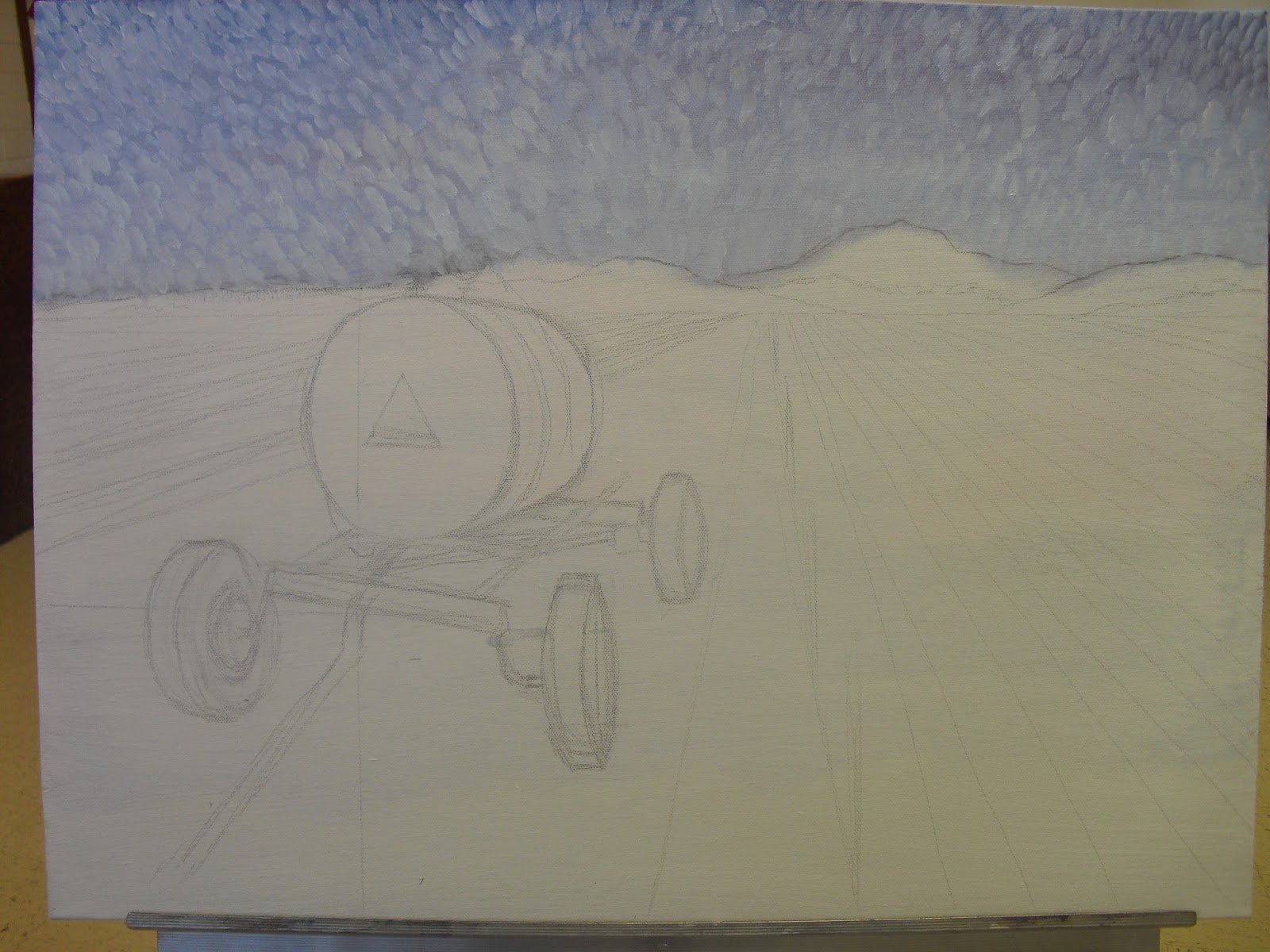
Drawn out, mask applied and shadows begun.  Sky done with manganese blue, one of my favorite blues. (It isn't a mixer and has very little power on it's own.  It's charm to me is the soft color for skies.)


I used ultramarine blue and burnt sienna for my background hills.


Hills and foreground added.  Trees just suggested, just like I've been taught.  Suggested, not rendered.  They could have been a dreamy blue, but that silly person in my mind kept saying, "trees are green" and over-riding my own good sense.


Here is what I ended up with.  I hated it, decided the back and middle grounds were too dark and went to bed.  If I'd have left it, it could at lease been a record of a not too bad learning experience.


So, here we go on the wreck part..  I got a bristle brush, wet down the mid and back grounds and began to scrub and lift pigment.  Not sure if this photo does the job justice, but it was pretty much pale and washed out by the time I was done punishing the poor thing.  


Enter my trusty black ink pen.  I love pen and ink work with watercolor, right?  This'll look great!  Hahaha!  It didn't.  So, now I have a record of a lesson learned that will hang on the wall of my studio to remind me to slow down.  I won't post the last photo, the one where I decided more pen work would surely do the trick.  I do have my pride.  


So, fellow wanderers, upward and onward.  I lived to paint another day.  One day I'll paint a really cool landscape.  Till then (or tomorrow, whichever comes first)!


Tuesday, August 20, 2013

Virden Farm

In an attempt to loosen up my style I painted this piece only laying one color down next to another.  No blending on the top layers  allowed, that was the rule.  By the time I was through I realized I had had a blast.  What fun this painting was!

This is 18"x24", oil on stretched linen canvas.  Not sure if I'll ever frame it, I like the bare look of the canvas alone.


Monday, August 19, 2013

It begins..

The Fall 2013 semester is here.  Yes, back to college has arrived already and I am not through exploring and growing in my paintings.  However, I will be okay!  If I can handle 23 credit hours this time around, I can pretty much handle anything, right?  Oh come on, Alice!  You raised 6 kids, you can handle school.  Pull up your britches and get moving.

Sometimes the voice that answers back inside my head is a real pain.  Hard to whine with a practical mind.

I have so many ideas for paintings that are crowding to get out, I'm just going to have to find time to make that happen.  I can paint an hour a day and still accomplish much.  Here is a big, acrylic piece I worked over for several weeks last semester.  Not because I had to fight my way through it, but because it needed to evolve.  I loved pondering on which colors to lay down next and how to achieve the values I wanted.  It's too big to hang anywhere, not a real masterpiece, but a satisfying painting anyway.  I learned quite a bit from it.

Still Life, 3 feet x 4 feet on primed masonite, acrylic


Saturday, August 17, 2013

Landscape Painting, by Mitchell Albala

First off, if you're going to invest in this, go with the hard copy.  I bought the ebook and after reading it will have to save up and buy the real thing.  Trying to navigate the ebook and see the illustrations along with the text that referred to them was cumbersome.  Artists are visual, right?  Go with the one that you can get the most visual use out of.

The sub-title of the book is Essential Concepts and Techniques for Plein Air and Studio Practice.  


I am basically a still life/figure painter.  That is what comes naturally to me and is how I think.  I have wanted to learn to paint landscapes for years and never managed to meet my own expectations.  Very few of my landscapes are in frames or have even been seen by eyes other than mine!  This book was purchased to give me some more ideas of how to think and see like a landscape artist.  Although I am still not painting what I would like to produce in this genre, I have some better idea of how to get there.

Particularly helpful to me were the chapters on "Limited Palettes" and "Simplification and Massing."  As a visual person, I see (and imagine you do too), details and colors galore.  A beginner, or a landscape dunce like myself, wants to paint every color and every detail they see.  Learning to only include what makes a good painting instead of what makes a good "picture" is essential.  I am finally beginning to understand that what I see is not as important as what I feel and want to portray to my viewer.  Color and light are more important than every leaf on a tree.  Composition should be considered instead of copying the actual scene as it presents itself to the artist.  If I want it to look like a photograph, I should just take a photograph!  Big, big lesson for me.  

As Albala describes atmosphere and light and color and how they affect one another in his chapter "Light and Color,"  the subtitle is a good introduction to the text:  "Real Light vs. Painter's Light: The Limitations of Paint."  These chapters will be read over and over until the information in them is instinctive to me and not just academic.

The final lesson to me was so liberating.  I hate trying to work from photos, but getting outside and painting is not always possible.  He shows how to use a photo for reference effectively without becoming a slave to that photo.  I painted a prickly pear cactus this week.  After studying it outside, really looking at it, I took photos of different parts of it.  In the studio I used several photos to remind myself of angles I liked and the nitty gritty details of how the pears look and how the spines grow for my sketch.  Then, I put the images away and painted from my heart.  What I produced was so much better than if I'd been sitting hunched over my photo trying to copy every detail.

Thank you, Mitchell Albala.  And reader, I would recommend this book to you as a very useful tool.  Enjoy, and paint from your heart!

Friday, August 16, 2013

Town day..

I live in the middle of nowhere.  When we go to town, we GO to town!  Today was a town day, no painting, no creativity unless you call turning 100.00 into groceries being creative. . .   me neither.  I just call that a drag.  $500.00 into groceries, now that would be more like fun!  I digress..

After the painting blitz of yesterday, I needed a break anyway and my library books were nearly two weeks overdue.  Yeah, I know.  It's been a wild summer.  You can't own 6 kids and their 3 (so far) spouses and 8 grandkids and spend much time worrying about what day your library books are due.  But, school is starting back up and I will get organized.  As organized as my right brain can handle without fritzing out.

I've been going back over paintings and looking at the journey so far.  I have to admit that going to college has been worth all of the bother and expense.  I have learned so much and am looking forward to learning more.  I wouldn't have learned this much at home.  In my studio I can dink around, snack, check my email or Facebook or wander off in search of some obscure thing.  When I have paid money and am being held to a performance standard, I perform.  Period.  What a great lesson on discipline it has been.

So, living in the boonies means I get to go to town 2 or 3 days a week for school.  140 miles round trip.  Here we go again, with homework, deadlines, juggling home life with school life and don't forget online classes!  The bane of my life.  And?  Get to the point.  The point is, even though I get tired of the drive and come home with my legs aching from sitting so long and have to pick up food and run errands around class schedules because I am "in town," I am grateful for the chance to go to school.  Grateful to keep learning things that have made my art and my life so much more interesting.  Mostly grateful for a husband who just sweetly supports me and tries to make things easier on me.

Here is one of my favorite paintings from a class.  It is 22x30 inches and done with soft pastel. The first piece in which I ever super-sized my subjects.  I was hooked and am still doing it today.


Thursday, August 15, 2013

Prickly Pear, Day 2 and Done

 Two days of pure fun represented here.  "Prickly Pear"  22x30 inches in size, this piece is pretty dramatic because of the increased scale of the subject.

Here is a close-up of the first pear section as it was in process.


This shows the under layers for the fruit areas, pale green with violet for shadow depth.  The needle sections were masked earlier, (now removed) leaving them pure white.  Time to begin to add pigment to these parts.  


Finished piece.  Probably.  I usually stew for a few days before I sign them to help me step back and see with a fresh eye.  This one will be turned in next week for my painting class, then hopefully sold to a new home or framed for exhibition.


Wednesday, August 14, 2013

Prickly Pear, day one

I am using 300 pound Arches, cold press paper for the first time on this project.  I have to say I love it.  It is taking some getting used to, it soaks up so much pigment that I am having to adjust how deep I apply the colors.  I am anxious to see how it looks after it has had the night to dry.  

So.. here is today's progress: 


 Using Rose Madder, Pthalo Blue and Cadmium Yellow Medium for my palette


Building up to put in the pears, may have a problem on the right side, but I can worry about that tomorrow, right?