Friday, February 19, 2010

Outside time

I love getting to spend time outside with a notebook and pen and some paints.  I have been surprised at the difference looking at my subject in the outdoor light makes in studio time.  After recording something from life it stays in my head, and then in the studio I can paint it more realistically. 

This sketch was done one summer afternoon last year while a storm rolled across the land.  I still can see it in my minds eye, whereas if I had taken a photo, it wouldn’t mean much in the studio.  I’ve been surprised at the difference this has made in my painting.

CIMG0931 

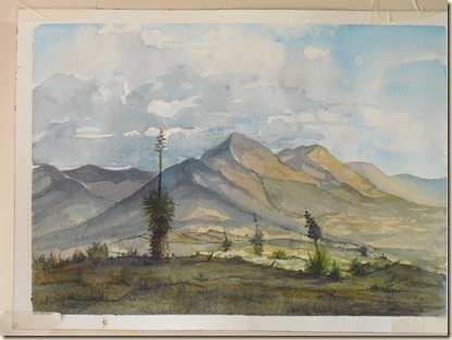
Later, in my studio I could recall so much of it as I worked on this painting:

CIMG0955


Yesterday I stopped along the road to get a gander at some Brigham Tea bush and decided to record it for a later painting.  I like working loose, but so far have only been able to work that way in sketches.  I get carried away in “Real” paintings!

CIMG0951


Contrast it with this little painting, which I tried to do from memory and couldn’t stop painting till I’d over painted it!  As usual…..

CIMG0957


Well, if simple is the goal, I have a lot of work to do!  Upward and onward!

Monday, February 8, 2010

Travel Watercolor Kit

CIMG0886


Travel kits! What watercolor painter doesn’t search for the perfect travel solution? I have seen some great little watercolor paint boxes made from Altoids cans, but could never find the trim that was used to hold the paint pans in place. Several paint manufacturers sell clever little sets that hold either tubes or half pans. Some have cute little water reservoirs and tiny paintbrushes, but all are pretty pricey. Paper; how to find a watercolor pad that is large enough to record what you see that still fits into a reasonably sized bag or backpack? I hate tiny little watercolor books that I feel like I have to work in miniature, and forget a teeny tiny little brush that isn’t comfortable in my hand!

I’ve tried several solutions over the years, but don’t use them much because they are just not practical to use on the go. SO- I finally bought some Altoids, donated the candy to my son and have been carrying the can around in my purse. I have felt it, and opened it and closed it and wondered how to get the paint pans to stay in place, where to mix colors and what colors I would most want to have in it. The thinking about it was as fun as the putting it together!

I wanted a mixture of full and half pans and decided on 9 basic colors of paint to put into it. The colors I use most get the full sized pans and the mixers get the half pans. I used a dot of rubber cement under each pan to hold it in place. That way, I can pull them out and re-arrange and stick them back in again when I want to. Each paint pan is only half full of paint to help in mixing, plus the lid will work for larger mixtures.

With a good quality travel brush, I am well on my way to a useable travel kit!


CIMG0885

From top, left: Quinacridone Rose, Burnt Sienna, Sepia, Phthalo Blue, Cobalt Turquoise, Cadmium Yellow, Cobalt Violet, Raw Sienna and Burnt Umber in the center.

A Travel Paintbrush

I have been looking for just the right travel brush for several years. I’ve tried putting my studio brushes into various carriers or other contraptions to protect the ends from being destroyed, but never had much success with anything I’ve tried. It’s always too bulky.

I got a flier from my favorite art supplier, and it had SABLE travel brushes advertised at really good sale prices, so I splurged. Always wanted a real sable brush, anyway! Wow! What a difference. I’ve been using Silverbrush Black Velvet brushes for a few years and thought they were really nice. Hmm, not compared to this little beauty. I have been converted! Now to get a night job to be able to afford a couple more of them.

CIMG0887

It’s an Escoda, #8, series 1218. It’s the same size as my Silverbrush #6, but holds more water/paint. It has a lovely snap and reshapes better than any brush I’ve ever used.

Good thing I only have to put in a half day tomorrow. I hope the light is bright and the weekend is warm!

CIMG0888

CIMG0889

Thursday, February 4, 2010

Paint

Ran out of Burnt Sienna and Phthalo Blue! Winsor Newton paints are quite nice, but SO pricey. I am definitely on a budget right now, so what to do? I set a limit of $35.00 for the paints I needed and then took an inventory of what I was almost out of. No sense in paying shipping for two tubes of paint when I’ll be out of other colors before too long. I needed 5 tubes of paint!

Daniel Smith watercolors are very nice and priced more reasonably than Winsor Newton, but still over my budget. Enter Dick Blick Art Supplies! My Studio flier came with an introduction to the all new Dick Blick watercolors, at pretty great prices to tempt me to give them a shot. Not only could I get 8, EIGHT tubes of paint with the money I had to spend, they said they’d throw in a $24.00 Lama Li travel watercolor book for free!! Who could resist? Certainly not me.

Along with my usual colors, I decided to try out Cobalt Turquoise and Cobalt Violet for fun. I’ve seen them used recently, but hadn’t had the chance to try them out.

I did wonder if I’d get a student grade of paint for my trouble, but decided it was worth the risk. What a great gamble it was! I love the paints. They mix beautifully and dried only slightly paler than they were laid down. All watercolor paints fade as they dry, to differing degrees, but these are still lively and vibrant after drying 3 days with only slight fading. I took a small piece of 140lb. watercolor paper and made a few mixtures to see what I’d get. I can hardly wait for time to make more color mixes with them. What fun!

The Lama Li watercolor paper book was out of stock so the company substituted a 50 page Savoir Faire, 6” x 8.5” book in instead! Wow, the paper is gorgeous! Now, if it’ll only stop raining long enough to let me get OUTSIDE for a few hours.

CIMG0890

CIMG0891

CIMG0893

Tuesday, January 19, 2010

My Favorite Painting From Last Year

I am slowly figuring out this blogging thing!  I wanted to post this painting, out of sequence, as it didn’t post with the other 2009 work.  It was the painting I learned the most from last year. 

I was trying out Bockingford watercolor paper.  It is tinted and one of my favorite watercolor artists, Edward Wesson, used it.  Well, I hated it.  My colors dried MUCH lighter than normal, it didn’t take a lot of working and tried to fall apart when I removed the tape from the edges.  This painting would have been vibrant and exciting had I used my usual paper. 

CIMG0476

The Long Weekend

Four glorious and warm days off of work!  I am a lucky duck.  Well, I am a fairly lazy duck, too.  We didn’t dust or vacuum or make the boys  get shovels and find their bedrooms again, and the same bits of spilled cat food are still on the laundry room floor. Too bad that old adage, “It’ll still be there later” is true. 
HOWEVER, I did finish a painting from last week and do two others.  I may be a sporadic cleaner, but I have high hopes that focusing on painting will pay off someday.  Amazing how one can justify anything, isn’t it?
My friend sent me four videos that he was through watching, two of David Curtis and two of Joseph Zbukvic doing watercolor demonstrations.  Blew my mind!  I paint in a tightly controlled way, and these two artists have loose, free styles that produce very lovely work. See:  http://jzbukvic.com/ if you want to see Joseph’s work.  It is worth looking at.
As I worked in pastel this weekend, then again in watercolor yesterday, I tried to put some more loose passages into the paintings.  The two styles of work make some real conflict for me.  I have so much to learn!
CIMG0856
This is a spot in Granite Gap where our family likes to picnic.  I loved painting on the spot, rather than in my studio from sketches and photos.  I learned quite a bit from the experience.
CIMG0849
This is a ranch house in the mountains close to us, belonging to dear friends.  I sketched it one afternoon, then brought the sketch into the studio and did this watercolor directly from the sketch.  Below is a pastel of the same house, but I’ve rearranged it a bit for my purposes.  I fought my way through the whole work; I seemed to have a hard time finding the right colors.  In the end, though it started to flow and I like the feeling of the light.
CIMG0848