Friday, September 30, 2016

Talent or Hard Work?

Okay, I know I've written about this before, but I wanted to share a video with you that I showed to my 6th graders today.  We are working on a clay unit and some of them freak out when their projects don't turn out how they envisioned.  Some of them are better at art skills than others, just like some are better at writing or math,  however, having a predilection or latent talent is only an indication of where ability lies.  Unless one is a savant or other remarkable personality, talent is not mastery.  


Take, for example, the above film clip of artist Andy Goldsworthy as he works to build one of his nature pieces. When one looks at pictures or even videos of his work on Youtube, they are flawless and inspire reverence for nature that few other artists achieve.  The failure of the structure and his reaction to that attest to the effort and time he puts into those pieces. Talent means nothing without a very real investment of time.  When someone tells an artist that they are "so talented," they are missing the point, missing the understanding that they are not looking at the result of mere talent- they are looking at the culmination of joy, frustration, tears, successes, failures and the current place one is on in a journey. And oh, what a journey it is!  

Thanks for stopping by- Alice 

Wednesday, September 28, 2016

Summer at Lake Powell

Not a very catchy title, but I'm too tired to come up with a better one.  I'm sure a good name will arrive in my  mind sooner or later.  The important part is, I finished it and lived to tell.  As you may know, I've been fighting to learn how to handle water for years.
Summer at Lake Powell
Watercolor on paper
22" x 30"
(Full sheet)

This time I was determined to take the reflections on water apart piece by piece and put them back together again in a way that actually looks like water.  Tedious, but actually very fun- even though it took two weeks to pull it off.  I learned so much and hopefully the next water painting won't be so intimidating.  I love painting.  Sometimes I hate it; however, I have to say it is never a boring event.

Thanks for stopping by!  Alice


Thursday, September 15, 2016

The Fun Part

How'd it get to be bedtime already??  I've been sitting out here for what seems like 20 minutes, but three hours later it's dark and if I'm going to be a nice lady tomorrow I have to go to bed now.  We can't have Mrs. Webb riding a broom around the school.  It tends to scare the little ones....  
Although I'm not finished with shadow shapes, I'm fatigued.  That's the time to step away, before I make a bad decision or get impatient and pushy.  It happens! 
Putting the shadow shapes onto the layers of color is, to me, the absolute most fun part of a rock-filled painting.  It's like wearing accessories.  Too much bling is tacky, but when you get it just right, the whole outfit works.  The shadows on this have been a total gas to do, but this poor old lady is going cross-eyed.  Happy, but cross-eyed none-the-less.  

Thanks for stopping by! Alice

Wednesday, September 14, 2016

The First Layer Can Be Scary

Whenever I start a painting this large and detailed I get nervous as I drop in the first layer of color.  Although the hues are right, until the shadow shapes begin it just looks vague and undecided.  Maybe this is good thing as it means I haven't overpainted it yet.  However, the possibility of that still lurks around the corner of tomorrow.  I can overpaint anything.  In my sleep with one hand tied behind my back.  Yep, I'm that.. er... good.

I enjoyed this sky process very much.  Wetting most of the sky area and then laying down blue streaks was fun.  Simple sky for a very detailed foreground.
In this piece I'm test-driving Daniel Smith's Burnt Sienna as the base of the red tones.  It leans a bit violet, not the rich orange-red I prefer.  However, I'm committed now and will have to just keep going.  Along with that color, I'm using Raw Sienna, Manganese Blue and Indigo.  Winsor Newton's Manganese is the perfect sky color.  Too weak to be much of a mixer, it is a clear, southwestern sky blue that looks like home to me.

The scary part.  Keep your fingers crossed!

It feels great to sit at my art table and lose myself in a project.  As an elementary art teacher, I often feel pulled clear to pieces by the end of the day.  Touched, patted, hugged, chattered to, tattled to, and called "Miss!" all day can leave me frazzled.  Don't get me wrong, it's sweet to be loved by my 248 (actual number, not an exaggeration like when I count grandkids..) students and I love them, too, but doing something that is all mine helps put me back together again.  Life can be intense at times!

Thanks for stopping by- Alice

Tuesday, September 13, 2016

You Don’t Have to Draw to be an Artist…

But it helps.  In college I noticed that there was more emphasis put on artist statements and performance art than on more old-fashioned skills like drawing and color theory.  I think that is a loss to students and makes becoming an artist more difficult.  Being able to draw accurately gives one the freedom of structure. There is freedom in accepting limits.  To purposely limit oneself is not an idea that modern society promotes, but is a timeless principle.   

 A quick charcoal sketch I did several years ago to see if my painting idea would work.  I actually like the sketch better than the painting.
I like to compare it to a sonnet.  There are rules for the structure that makes a poetic effort a sonnet.  As long as you stick to those rules, you are free to say whatever you want to say.  You can make your point clear or more obscure as long as you keep the structure in a sonnet form.  It’s the same when I draw out a painting.  I can still choose whatever colors I want, how many details to include or where to put contrasts and, as long as I stick with the chosen structure- the drawing- it will still be what I designed it to be. 
Another quick sketch to see if I liked an idea enough to paint it.  It doesn't have to be wonderful to be useful.

To keep my skills honed and ready, I find I have to practice regularly.  It’s not enough to learn it, check it off the list and move on to other, more exciting things.  It has to be kept up to date and used often to stay accessible.  For me it’s easy to get caught up in the idea that it has to be a great drawing.  Silly me.  Any old piece of paper, of any old subject, in any old place will do the trick.  Keeping the hand and eye in sync is the goal.

Done on light weight sketch paper, this colored drawing still makes me happy.  Wish I could figure out how to work this loose more often! I think using junk paper made it more fun to do, too.  
So, tonight I am working away on the next painting, thinking about how glad I am to be able to draw this complex thing out- and getting my exercise in the process. 

Thanks for stopping by! Alice


Monday, September 12, 2016

Art is Magic Sometimes

This afternoon I left work and headed straight home for my bed and some serious whining. I've caught a virus and felt pretty rotten the past few days.  However, after I got home, my brain wouldn't turn off and let me rest.  One can only go over lesson plans so many times before insanity sets in.  In an effort to get my mind going in a new rut I got my favorite inspirational book out, "Painters of Utah's Canyons and Deserts," and climbed into bed.
Pure eye-candy to me, this book can hold my mind for hours

Before very long I found myself out here in the studio looking through my photo files at records of canyon walls from trips we've taken.  I forgot I didn't feel well and got lost in the beautiful places I love.  In fact, I got so lost that here it is bedtime and I'm well on my way into a major project.
Drawing out canyon walls of my own.  Wish I could play hooky tomorrow and start dropping color into the paper!


So, as the enchantment subsides, my head aches again and it's time to stop for the night. Just looking at something that stirs me so deeply as these paintings has ignited a flame of inspiration and helped me forget my silly little woes for a few hours.  Art is powerful, and not only for those who view it.  It has magical abilities when at its best- and those who are captured by the spell to make it get to participate in that magic now and then.  And it feels lovely.

Thanks for stopping by! Alice

Thursday, September 8, 2016

How Does One Value Art?


Eight years ago I took a watercolor class from David Vega Chavez.  Chavez is one of my very favorite watercolorists and I was lucky to get to learn from him.  He is a self-taught painter and has taken the lessons he learned from his chosen mentor, Edward Wesson, and gone beyond Wesson's techniques to make a style very much his own.  He taught the classes I attended the same way he began in watercolor, from Wesson.  Although my style is not very Wesson-like, or even very Chavez-like, I can see that both have influenced what I do, what I know and how I feel about watercolor.  You know, I doubt either painter set out to influence others when they began to learn their discipline.  Creativity is just something one does, right?  Like breathing.  We live, we breath and when it grabs you by the heart, (or possibly the throat) you create stuff.
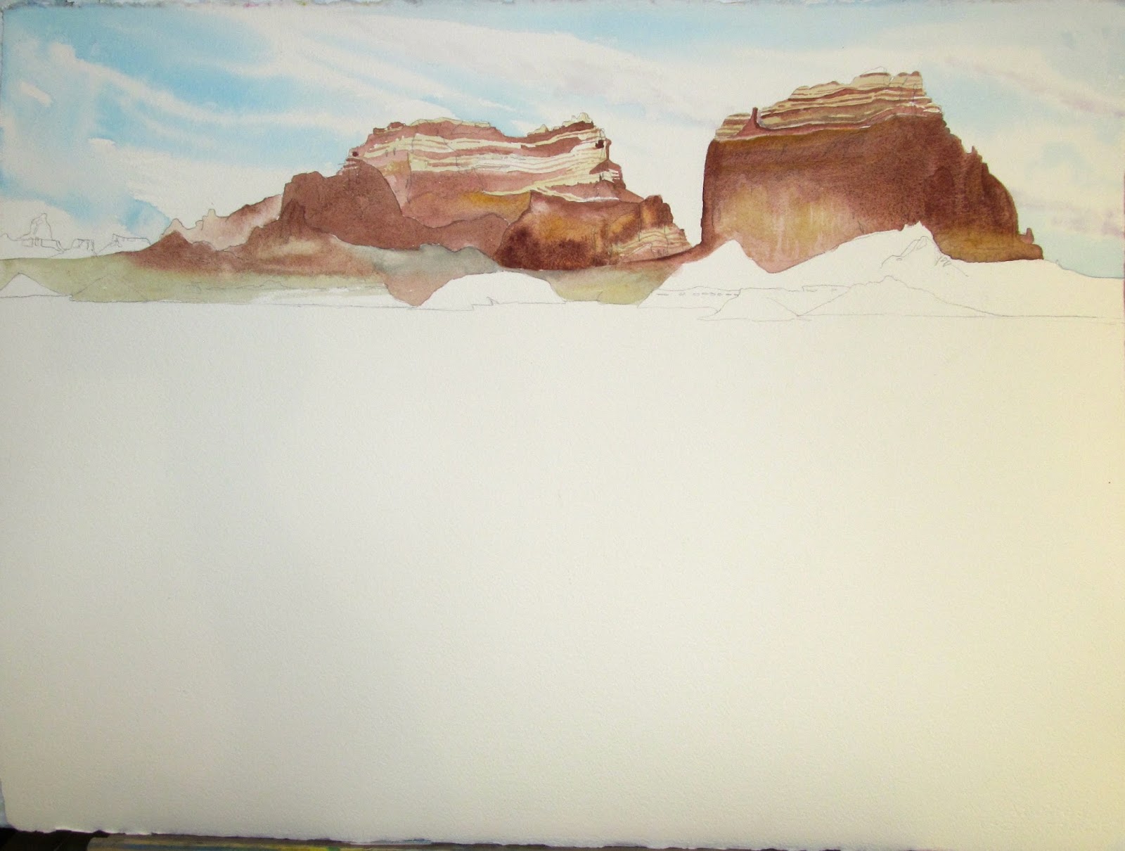
This painting was done at the end of my classes with David Vega Chavez.  You can see both his and Wesson's influence in this piece. 
Recently my daughter, Katie Kellogg, and I had a conversation about why we create art and whether it has value.  As a busy mother of 200 children, Katie has moments of guilt about time spent in her studio and wonders if she needs to justify her efforts.  Our society tends to measure value by dollars and cents.  In other words, if my work doesn't earn money, is it worth the time spent on it?  Can one spend time painting, or sculpting or writing or whatever creative pursuit one does for any other purpose than income?  Should one?  When she and I considered an artist whose work has enriched our lives, even though we don't either of us own one thing from that artist, we realized that what they had done had value to us.  Value because it taught us something more about ourselves and added to our knowledge.  We agreed, their work has great value.  

Done immediately after the one above, these two small paintings are some of my treasures.  After the class was over, no matter how I tried, I could never replicate this look.  It was as though it didn't belong to me.  I can see bits of this style in my current work, but only I could show you where it is.
None of us knows in this digital age who will see or experience what we do and be touched by it. In a way, it is a gift of freewill.  You put it out there, you hope someone likes it and let go of it.  It will go places you will never know about and maybe even inspire someone who needs it, your own little ambassador of the things in your heart.  And even though you are not aware of it, a small piece of something inside of your spirit will be communicated to another.  It could influence their art, soothe the wrinkles in their souls or even become part of a gift they pass on to another.  So, does that equal value?  I say it does.  And my creative self thanks David Vega Chavez, and through Chavez it thanks Wesson.  And whoever inspired him.  And that is a very sweet and complete thought to me.  Of course my art has value.  And it's monetary value is the very least of it.  

Thanks for stopping by! Alice

Wednesday, September 7, 2016

30 Minutes With Inktense

After work today I had 30 minutes to run out here to the studio and mess around.  I’ve been anxious to begin learning how to use my new Inktense Watercolor pencils on fabric.  Youtube has great videos on the subject, but nothing replaces jumping in and giving it a go. 

Drawn on a piece of an old bed sheet, I didn't even take the time to get the wrinkles out. 
With only half an hour to spend I knew it’d be a fast, down and dirty experiment- so of course it was fun because there was no possibility of pressure to perform.  Drawing out a rectangle with the highlighter pencil- which came with my set of 24- showed me that that pencil is more than fluff, it worked smoothly and made drawing on the fabric easy. 

The Inktense pencil marks, laid in dry onto dry, before water was added.
Figuring I’d start working dry into dry fabric, I laid down two blues in the sky area and then began to add water to blend them.  I certainly won’t need to do that again.  The color bled out of the picture plane with the water and left strong pencil marks on the material as well.  Oops. 

Well, all I could do at this point was sit and watch the color run. The weird looking patches are the fabric stuck to the board behind it with water.  
With that understood, I wet down the whole thing and began to stroke the pencils into the rest of the piece dry into wet.  That worked great, actually.   The colors were intense, but stayed right where I put them in, no feathering out of their boundaries. 

The finished piece, drying.  This stuff has real possibilities.
Where I had not completely wet the fabric, namely at the left edge of the mountain shapes, the ink bled out again.  However, as long as the fabric was wet, I could add color over color and the hues just got richer.  The thin brush shapes kept their lines and the wide areas didn’t run into them. 

Detail of where the color ran in the area I hadn't pre-wet. 
Okay, this was fun.  When I get to town next, I will purchase a bottle of fabric medium to use instead of water on round two.  I suspect that the results will be quite different.  It was a fun exercise, even if a very short one and I will certainly be trying more of this.  

Thanks for stopping by! Alice

Tuesday, September 6, 2016

Enter, My Old Toothbrush

When I was pretty sure I'd ruined the painting I posted about yesterday, I decided it couldn't hurt to try a rescue.  If you have nothing else to lose in a piece, you might as well, right?  I keep an old toothbrush in my paintbrush cup for just such a job.  Flooding the psychotic green area with water, I began to scrub and lift with paper towels.  This is on 300 pound paper, which gives me a lot more ability to scrub and lift than I would get on a lighter paper.  A 140 or 90 pound watercolor paper wouldn't accept this much punishment, but you can do some lifting.  
Close up like this, the glaring green is even worse.  An old toothbrush is a great painting tool.  It splatters, scrubs and lifts very well.
After I had gotten all of the pigment out of the paper I could, I let it dry out.  The poor painting looked relieved.  It can't be easy projecting such a lurid shade all day.  

After the scrubbed out area dried, this is what was left.  Still a lot of green to contend with, but at least now there were possibilities.
Although the hue was much less concentrated, there was still green to deal with.  A very un-southwestern shade of green, too.  However, there was hope for a rescue at this point.  

A closeup of the green after adding Burnt Sienna and Yellow Ochre glazes over the green mess.
I decided to neutralize the green a bit with Burnt Sienna.  There was no going lighter at this point and the new foreground would still be a bit dark, but it couldn't be worse than it had been.  

The first row of vegetation begins.  No green needed here, I used yellow at the top of the shapes and violet for the shaded parts.  It still reads green, but is really not.
Laying a Medium Cadmium Yellow around the edges of the of farthest edge of the vegetation shapes, I used a violet mixed with Burnt Sienna and Indigo to darken the bottoms of the shapes.  Together they made a much more believable green.  

The foremost bush shapes are ready to drop in at this point, but it's already obvious that the only way to make something this dark work is to make a darker area at the opposite edge.  Adjust, adjust, adjust..
With the foreground being such a dark value I could see the cloud areas were too light now.  It's always a series of adjustments.  If you darken one place, you have to darken another to balance it out.  

The finished piece with the dark cloud shapes at the top of the paper.  Not a masterpiece, but now a usable painting.  In retrospect, I should have composed the piece with more foreground than sky, but it was an experiment.    
All in all, a much more satisfactory outcome.  The dark values at top and bottom work better together and emphasize the shadows on the bluff shapes better.  I am happier with it and feel like I learned a ton from this painting.  What a luxury; a day in the studio to spend learning and growing.  

Thanks for stopping by! Alice

Monday, September 5, 2016

I Hate Green

Yep, most of the time, I hate green.  It’s not an easy color to work with and can easily overpower an otherwise good landscape.  Often.  Sigh…
 
The greens just got too vivid and it's easy to do.


Maybe I need to find a green substitute.  Other painters have and their vegetation shapes work out beautifully.  This is something I know, but each time I think, “Nah, I can pull it off.”  Right.  I’m actually very frustrated this afternoon, but I’ll get over it. 
After eating half a chocolate bar and taking a little while to cool down, I added a layer of blue over the green area to tone it down a bit.  In retrospect, I should have tried a layer of Burnt Sienna over it to neutralize it.  Guess I needed more time to cool off...

The truth is, I’ve learned that if I want a body of good work, I have to paint a lot.  Some of my pieces will be things I’m happy with but most of them will be mediocre.  When one gets painting days only occasionally like around here lately, it slows down progress and makes it seem like one can only turn out the mediocre stuff.  I know it’s not true, but it’s easy to forget. 
The image cropped.  Nope, it still doesn't fix the problem.  Oh well, you win some, you lose some.  

One positive thing to take out of today’s painting session is that I know what direction I need to work- finding better ways to represent green vegetation.  Brown and blue?  Yellow shades with a bit of raw umber?  Hmmm, sounds intriguing. 


Thank you for stopping by! Alice