Friday, October 31, 2014

Crowning Glory, Work in Progress 2

Did I ever so confidently state that I'd finish this painting in another day's work?  Please note that I was not in my right mind when I rashly made that declaration!  Holy smokes, Batman, those were the words of an innocent. Today, I am no longer under any such delusions and fully realize that I bit off a great big bite with this one.  It seems to be working out like I had envisioned, but it's a long, painstaking process.  However, there is progress and I will triumph!!

I hope.

Beginning to put the details into the fruit shapes.  At this point, I about freaked clear out thinking that adding an underpainting of yellow was a terrible idea.  I might still think that, but the finished piece will tell the real story.  

The color is finally on the fruit shapes but they won't be finished until the mask is off and the details added.  Patience, Alice, patience.  

Beginning to add color to the tips of the fruits and under the needle areas..

By this point, I'd added another glaze of paint over the rib area and had begun to take the mask off of the center of the "crown."  I quit that when I remembered that I wanted to add thorn shadows before I took the mask off.  This is where I stopped today because I was going cross-eyed.  Time to take a break.  It is interesting to me that the size of this makes it hard to see the scope of it in a little bitty photo.  


Okay, maybe tomorrow will be the real day this thing is finished!  Hope springs eternal.

Tuesday, October 28, 2014

Crowning Glory; Work in Progress


The last painting to finish before my show is the largest watercolor I've ever attempted.  The paper measures 30" x 41.5" - and is 300 lb. cold pressed Arches.  That's a pretty big piece of paper to manage.  I've been worried about it for weeks because I knew I'd be doing lots of details and some large areas that would have to be done in one pass.  

As a watercolor beginner I couldn't envision the steps each painting would take and now and then I'd paint myself into a corner.  However, now that I've gained more experience, I feel like I've been able to plan the steps for this and so far the piece is working like I'd hoped.   Painting in watercolor for me is a series of color layers, and the one you start with matters.   


After I drew it out, I began to mask the areas that would need to be white.  This took an entire day, and I still needed to mask after some color layers were laid down.  

The center of this cactus is in deep shadow.  As I put each layer of color in this area, I mask a few more thorn shapes.  

The ribs of the cactus are under painted, then the fruit areas are given a quick layer of yellow.  The yellow will show through, but hopefully not overwhelm the whole thing like it's doing here!

Each fruit shape has yellow petal things on it, so these need masked out before the greens and blues are added to preserve them.  I liked the way the mask looked after it dried; shiny.  


Different angle with the mask drying.  

Starting to paint the fruits; looks like something you'd see under a microscope at this point!  

I have to stop and eat.  It's easy to get involved in a project and forget to eat, or drink or even take a bathroom break!  This is where I'll leave it for the night.  So far it looks, to me anyway, like a bad tie dye tee shirt job!! I'm excited to get to the details when it starts to pop.  

We begin to hang the show next week, so this will have to be finished by Monday.  Stay tuned for the grand finale!  


Thursday, October 16, 2014

Cool Masque Products

This painting was inspired by a barrel cactus and it was really FUN to paint!  Using a masque layer makes the cacti paintings so much easier to do.  I thought I'd show you the masques I use the most in case you have thought about using them and wondered how well they work.
This masque is applied with a brush.  Wetting the brush and then running it over a bar of soap a couple of times keeps the masque from drying in the brush and ruining it while you work.  Makes it much easier to rinse out.  Hint: Never use your good brushes to apply masque.  They'll never, ever be the same again!  

The green colored masque is applied using the handy bottle in the photo below with the blue lid.  It really makes small lines work like a snap.  

The white masque used on this project is the Incredible Mask brand.  I like it.  The Fineline Resist Pen is in the center and the Miskit, by Grumbacher is another favorite of mine.  It dries orange, making it easy to see on the paper surface. 

The tip of the Fineline

This square eraser is a great tool for removing the masque.  On the left, you can see the white paper that is exposed when the masque is taken off. 

The eraser just lifts and peels the stuff right up.  Pretty fun to take off, actually.

This closeup is to show the color being added to the needle areas contrasted next to the plain white of the paper before it's painted.  

Barrel Cactus, Watercolor on 300 pound cold pressed paper
22" x 30"

Monday, October 13, 2014

Near the Fire

I have a rule: Finish every painting.  No matter how badly it's going.  Blech.

This brings us to the agave painting I began recently and posted here: http://whatercolorit.blogspot.com/2014/09/color-study-with-sedimentary-color.html

It is now finished.  I am tired; it was a fight to the end.  Why some paintings nearly paint themselves and some have to be fought to the ground, I don't know, but this one has been rough.

I may be able to use it for my show, I may put it away in the dark and look at it again in a year or two!

Lessons learned from this project:

  • Sedimentary paints don't blend and flow together like stainers
  • Rough paper with these pigments will keep them from blending even more
  • To look their best, sedimentary paints want to be used as transparently as possible.

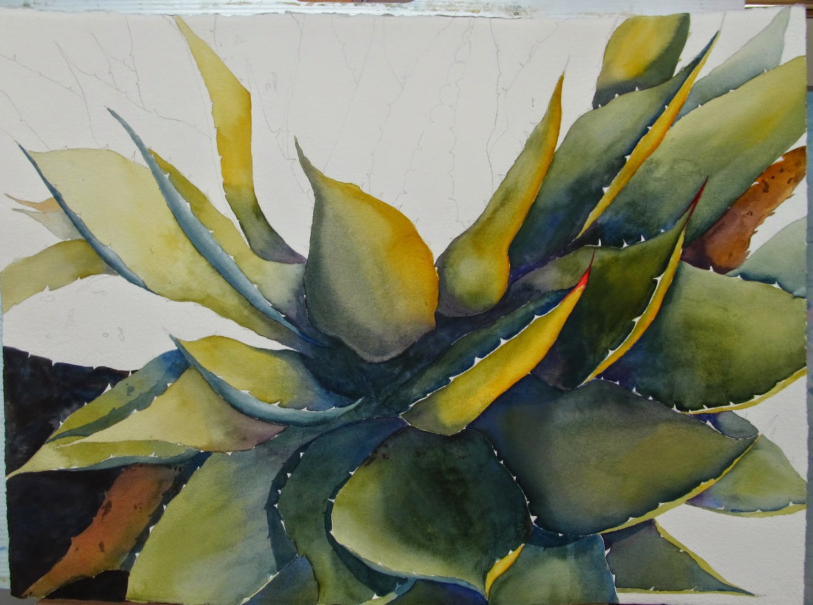
I wanted this to look like it was in the darkness, next to a bright light source, so I mixed the darkest paint I could for the edge shapes.


I realized at this point that with a light source close by, there would be shadows cast on some of the leaves.  Figuring out where was actually fun.


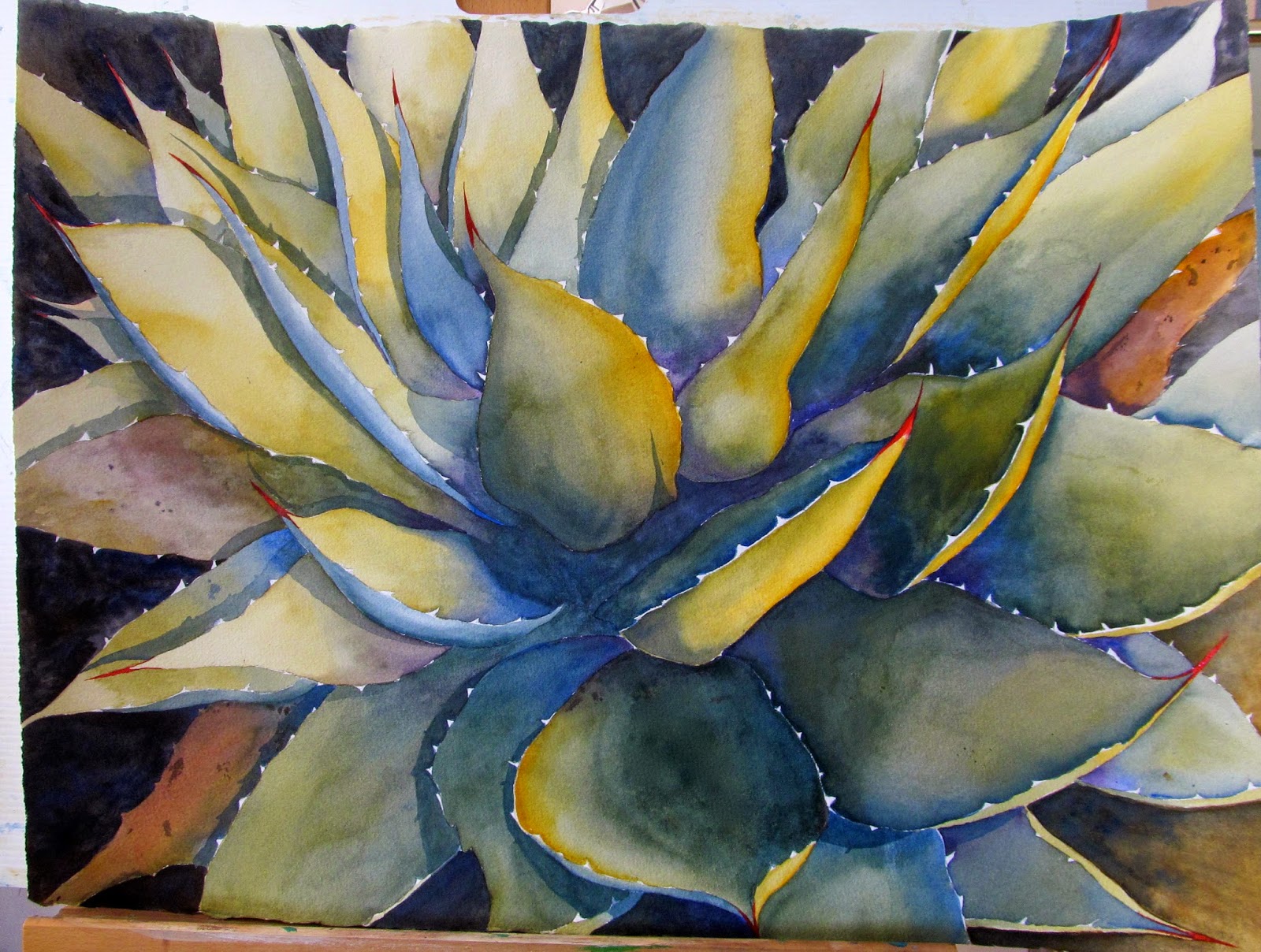
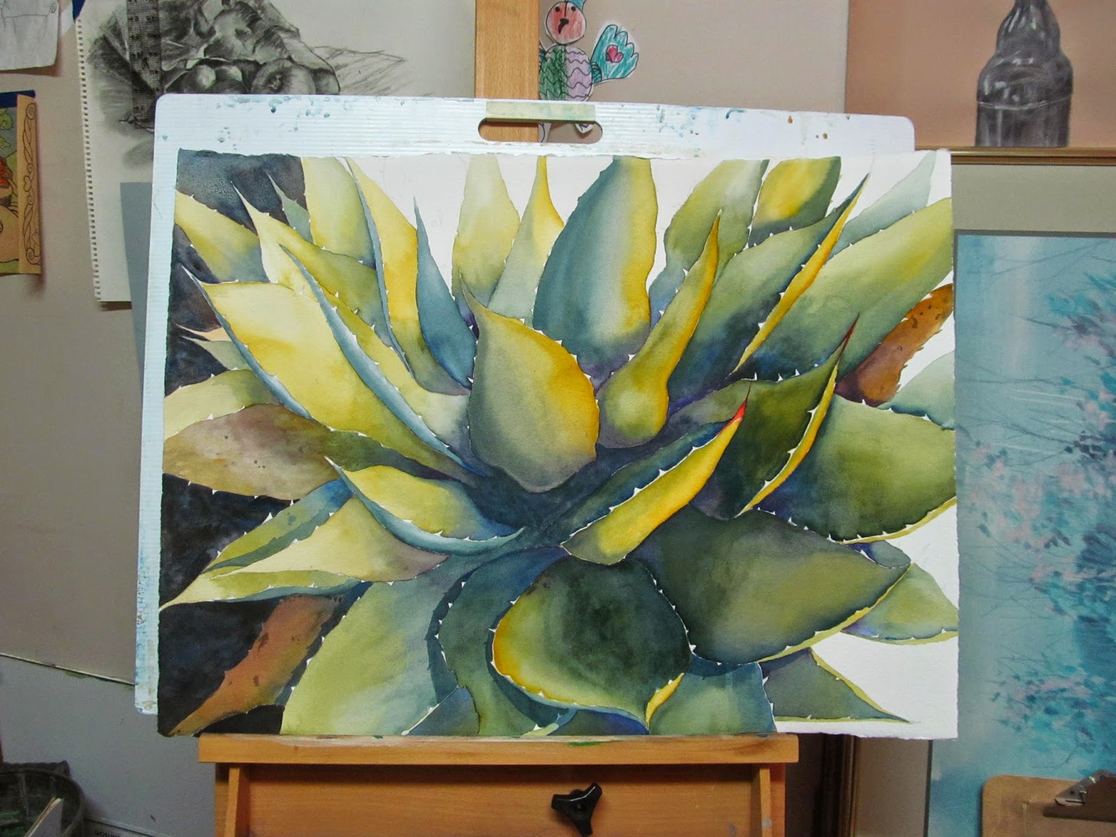
The finished piece.  There has been so much water soaked into this paper that I'm not sure if I'll ever get it to lay flat again!
Near the Fire, Watercolor on paper, 22" X 30"

It's time to start another painting.  What colors and paper to use will keep my mind chewing away for the afternoon.  One thing though is already decided, there will be NO New Gamboge in it!! 

Friday, October 3, 2014

Painting Reflections in Metal

 Often times, I have 2 paintings going at the same time.  This one is happening in my studio at the University.  Learning to paint shiny metal is intimidating at first.  However, it is also really fun once you get the idea.

To begin, I primed the paper with Raw Sienna to tone it down just a tad.  This means I will need to use brighter hues in a few spots for contrast.


On top of the Raw Sienna wash over the paper, the fruit areas were painted in with blue hues to set their shadow/light areas.   The pitcher is a silver toned metal, so a painting of it has to be that color, too.  Before any reflections can be added to it, a foundation of grey is laid down first.  That foundation is the new lightest value of the pitcher shape.

I begin the reflections in a fairly pale value as that leaves me room to adjust them as I need to.

The fruit reflections and a tiny portrait of me come in next.  You can see on the left side of the pitcher area that the fruit shape has been under painted in preparation for the local, or natural, color to be added.  


In the reflected oranges, I painted a black/indigo mixture under them before adding the local color as shown above.  The reflections should be the color of the fruit plus the color of the metal they are painted into. They also reflect from the lip of the pitcher area and will reflect, or cast color onto the surface they are sitting on.  

As I paint the oranges and their shadows, I'll be able to see how to adjust the values in the reflections of the pitcher area.  So far, I'm planning on a very dark background, which will also affect the values of the subjects of the painting.  Every thing that gets added to a piece affects what is already in it.  A painting is a series of adjustments until that magical moment it is finally finished.  As this progresses, I'll post it to finish this concept.